3D box effect with CSS
(For the impatient, here’s the link to the live demo with source files.)
While we wait (and wait… and wait…) for CSS3 to be implemented across all the major browsers, I thought I’d post my method for creating a 3D box effect using plain old CSS2 and less than 300 bytes of images. Of course, the border-image property will eventually make this method obsolete, but who knows when that will be?
First, a caveat: with this method, you need to specify a fixed width and size the images accordingly. A fluid width version wouldn’t be too hard to do, but it would involve some nested divs and more images.
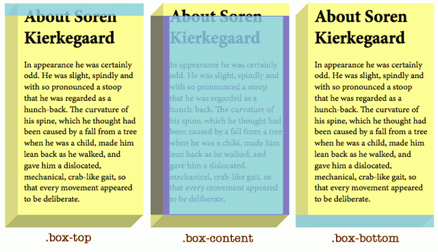
Take a look at the screenshot above. The box is made up of 3 divs (I know, I’m cringing too, but I couldn’t find a simpler way of doing it without relying too much on images). Here’s the html:
<div class="box-top"> </div>
    <div class="box-content">
        <h1>Content Title</h1>
        <p>Content goes here.</p>
    </div>
<div class="box-bottom"> </div>
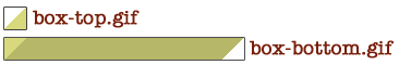
These are the only two images you need (source files here):
And now for the CSS to pull it all together:
.box-content {
    width: 180px;
    background-color: #FEFF91;
    margin: 0;
    padding: 1px 10px; /* Top and bottom values cannot be zero */
    border-left: 20px solid #D8D97C;
}
.box-top, .box-bottom {
    height: 20px;
    width: 220px;
    background: #FEFF91 url(box-top.gif) no-repeat;
    margin: 0;
    padding: 0;
}
.box-bottom {
    background-image: url(box-bottom.gif);
}
h1 {
    margin: -15px 0 0 0;
}
Easy! If you want to see a live demo and download the source files, check it out here. It’s really easy to change the colours of the images with the paint bucket tool in Photoshop (or even Microsoft Paint, whatever).
Sam Nabi
Comments
While not quite as rock solid (yet) this effect can easily be recreated in CSS.
I liked the aesthetic and gave it a shot here:
http://jsfiddle.net/StevenSokulski/9H6RG
Post a comment